Introduction
It’s almost impossible to find a business that is even moderately popular, that doesn’t have a logo. Logos have become the most popular aspect of brands.
So why does a brand or a business need a logo? In addition to being the most iconic way to identify themselves, businesses use their logos to promote the essence of their brand. Some logos have become a status symbol and increase the value of the brand.
But not everyone gets their logos right, at least not in the first few times. Even the biggest players have seen their logos evolve with time. So how do you go about creating a great logo? That’s what we’ll be discussing in this article, so read till the end.
The following are a list of tips that can make your Logo designing experience a lot more meaningful and successful. I’ve included examples from some of the biggest brands, so you know what I mean with each tip.
Express Your Brand Identity
Designing a great logo is not too difficult whether you decide to hire a designer or go the way of an online logo maker tool. What most businesses find hard is matching their logos with the rest of their brand and values.
It is imperative that brand values are clearly defined so that they can be integrated into logo design. A logo should identify not only what the business is about, but also help to set it apart from the competition.
Toyota’s iconic logo consisting of three ovals, is an excellent example of expressing brand identity through a logo. The two ovals in the center stand for the trust between the company and its customers, while the outer oval signifies global expansion.
Despite not having an official confirmation, many believe that the logo also depicts all six letters of the brand name Toyota. This type of association makes a logo memorable and helps to promote the brand.
Online tools use AI Algorithms to provide many interesting logo options. All you have to do is enter some basic details regarding your business. First impressions mean everything, so a logo that depicts a business’s values is a lot more valuable than one that has a better visual design.
Picking Colors
Color plays a vital role in making your logo memorable and unique. It is not just the colors that are important, the decision to use a single color, multiple colors, or grayscale. Many famous logos use a single color that amplifies the organization’s culture or business values.
It is generally believed that Green signifies nature and sustainability, Red signifies aggressiveness and anger, and Blue signifies calmness and clarity. There are many other combinations of colors and meanings. However, each logo is unique, and its color can be used to mean many things based on its other characteristics.
The tricky part about selecting the colors for your logo is that not all colors work well with each other. Experienced designers are knowledgeable about these combinations, but you can still create a logo with well-matched colors even if you don’t want to hire a designer.
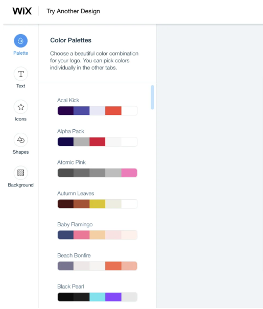
Color Palette tool – Wix Logo Maker
Tools like the Wix Logo Maker provide color combinations that work well with each other. Some of these combinations consist of similar colors, while others contrast each other.
It is important to keep in mind that the colors of the logo and the logo itself are at the center of all other branding efforts. A logo and its colors need to work well on both stationery and online media.
Design Queues
In addition to color, many other design aspects affect the uniqueness of a logo. The most important of these is typography, especially for a logo that contains text either within the emblem or as accompanying text.
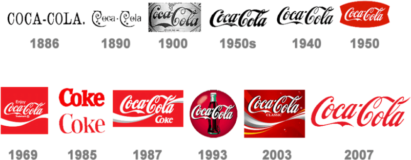
Coca Cola’s logo may be the only aspect of its branding that has seen more evolutions than the ever-changing shape of its iconic bottle. However, the Spencerian script, which it uses, has always been part of its design. Coca Cola’s iconic font is unmistakable even when it is not surrounded by the unforgettable Coca Cola Red.
The Wix Logo Maker provides a large selection of fonts that can be used with logos, as shown above. This allows users to avoid commonly used font types.
Symmetry and proportion are two other aspects of designing a logo that have equal importance. The Toyota logo that we discussed earlier is also a good example of symmetry. Twitter’s logo uses a number of circles as the boundaries of its logo and is a great example of proportionate design.
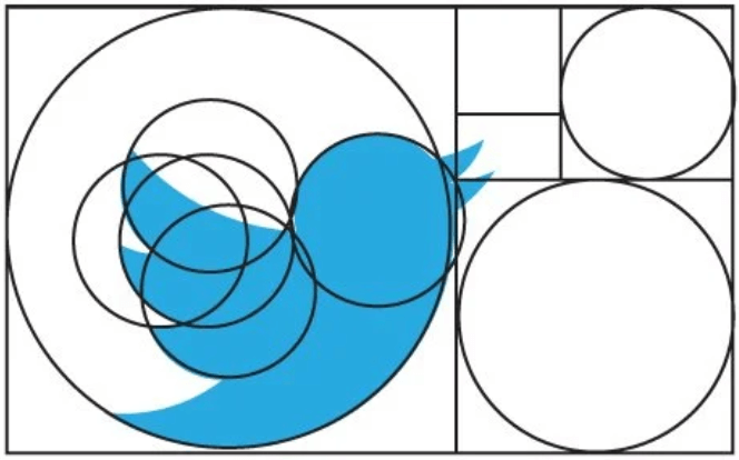
The Apple logo is also a great example of symmetry and proportion. While it may seem asymmetric at first glance, it uses an approach similar to that of Twitter’s to make all curves proportionate.
Some logos use negative space to promote their values and hidden meanings. FedEx is famous for its use of negative space to signify a forward-facing arrow between the letters “E” and “x” in its logo. However, there are many other logos that make even better use of negative space.

All four of the logos shown above use negative space in unique ways:
– Paint the city use it to depict a cityscape on a tin of paint.
– The Bronx Zoo logo uses negative space to show the iconic New York skyline.
– Lion Bird mainly consists of a bird, with the face of a lion being depicted through negative space.
– The “S” in the USA network logo is also depicted through negative space.
Last but not least, logos need to be layout-independent. That is, they need to fit well on many layouts such as stationery, online media, and social media. Logos with larger icons and less text work better, especially on social media. This is because they are more easily recognizable, even at a smaller size. Typically, logos with more text or rectangular shapes are not recommended for this reason.
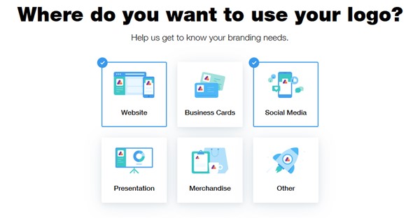
As shown above, Wix allows users to select the media on which they wish to use the logo and takes this information into consideration when creating the logo layout.
Find the Right Type of Logo
Logos come in all shapes and sizes. Some have only an image, some only text, and some others have both. One of the most popular trends in current times is to merge two or more images to create a hybrid logo.
The main focus of Evernote’s logo is an Elephant signifying memory – an Elephant never forgets. But there’s also a paper with a folded corner, and the color green is used to signify its commitment toward saving trees by encouraging paperless note-taking.Many online tools like Tailor Brands allow you to design logos with only an icon, only text, or both.
Tailor Brands – Choose Logo Type
In contrast to the Evernote logo, which almost always includes its name as text, Twitter’s iconic logo simply consists of a mountain bluebird that is unmistakable.
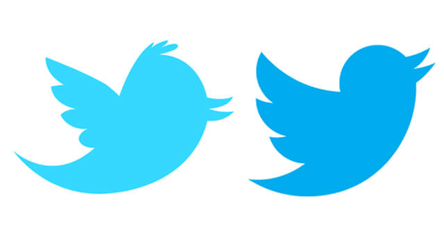
Twitter’s logo is also an excellent example of the evolution of a logo. Originally, it showed a bird perched, whereas the logo has evolved to show a bird flying upwards, signifying its exponential growth.

Amazon’s online shopping portal turns logo design on its head by using text as the more prominent part of its logo. So what’s so special about it? If you haven’t already noticed, the arrow beneath the text points from A to Z. This visual queue signifies that they sell all types of products from A to Z.
Assess the Competition
Having a look at your competition is a great way to come up with some ideas for your logo. You’ll be able to understand both the dos and the don’ts based on how customers respond to each of them.
A detailed competitor analysis is essential irrespective of whether you use an online logo maker tool or hire a designer. Each industry will have a group of organizations that compete for the same market space. Brand image and reputation can have a big impact on customer choice.
A memorable logo and a catchy tagline can draw customers to products in saturated markets. So it may be futile to attempt to create an attractive logo without knowing your competitors.
Avoid Clichés
An important tip when creating a logo is to avoid those clichés that sometimes nauseate customers. If you followed the earlier tip, then there is a high chance that you based your logo on that of one of your competitors. You may have done so because that logo had something interesting, or obvious in your industry.
The problem with clichés is that they take away originality. It is vital to have a brand image and a set of brand values that are unique and interesting, especially in a saturated market with many similar competitors. Online tools usually counter this by having a large number of icon designs. However, it is vital to use the customization options to ensure that logos don’t follow obvious clichés.
Some of the well-known clichés are logos with arcs above them, overlapping first letters, or logos with an object that signifies the industry. Automotive and home care brands are some obvious examples of this type of cliché. Generic logos such as those shown below make brands boring and uninteresting.

We’ll be discussing negative space with more detail in one of the next sections, however here we discuss its use in the form of a cliché. Many logos related to Africa use negative space to depict the African continent.

Keep it Simple
We’ve all seen those logos with so many components that we don’t really know what they are all about. The main problem with such logos is that they are hardly memorable, and the brand may suffer due to this.
Do I even need to tell you that this is Nike’s “Just Do It” logo? That’s the power of simplicity. Even without the brand name or tagline accompanying it, this iconic check mark never fails to remind us of the Nike brand.
Popular car makers promote the same effect with their logos, which have evolved into simplified versions of their original emblems. Mercedes Benz is one such example. The Target retail chain, Beats headphones, and Lux soap are other great examples of simple logos using both images and text. Target’s logo uses alternating red and white circles to signify a target like on a dartboard. The Lux logo stands for the perceived luxurious nature of its products and uses simple text in an easily recognizable manner.

Make It Unique and Ownable
Nothing says “Apple Inc.” more than the bite in its unforgettable logo. There have been many speculations about its meaning and some have even identified it as the oval in the Samsung logo. This plays on the rivalry between the two mobile phone manufacturers giving Apple an edge by making its logo more unique and interesting.
A logo that promotes ownership and uniqueness is a lot more valuable for brand value. It’s safe to say that the uniqueness of a logo makes it more “ownable”. However, certain generic logos have become so due to long term usage.
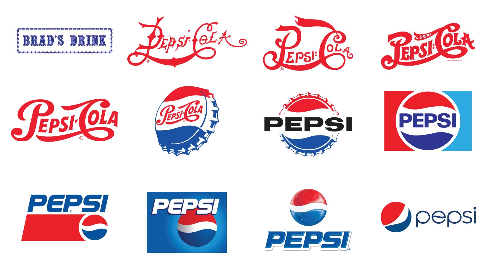
The Coca Cola logo has also been ripped off by many brands. However, none of them have been able to own their logos quite as Coca Cola has. The Pepsi Company, or as it was earlier known Pepsi Cola, also used similar typography for its logo in the early 1900s without much success. They then changed to the now famous Pepsi logo, which has risen in fame during the past few decades.
Communication is Key
One of the most common problems companies face is design teams coming up with logo designs that have no relevance to the brand or its values. This is mainly caused due to a lack of communication between the company’s representatives and the design team.
As a solution to this, companies can make use of online tools as they allow them to create logos that can be used as drafts for the actual team to improve. The AI algorithm can provide interesting options with many colors and designs. Designers can then add touches of uniqueness, which make logos interesting and memorable.
Conclusion
Iconic logos like that of Coca Cola have supplemented its brand image for over a century. While it has undergone some level of change, its unique typography and color have remained mostly unchanged. The brand image landscape is a lot more fast-moving in present times, with many brands renewing their logos and branding every few years.
Many online tools have AI algorithms that can give you a headstart, but you may still be better off getting a designer if you want a truly unique logo that depicts your brand values.

